Bread Consumption Map
Where in the World Is Bread Loved the Most?
Few things beat the smell of fresh bread coming out of the oven. But how much of it actually makes it to the table? The answer might surprise you.
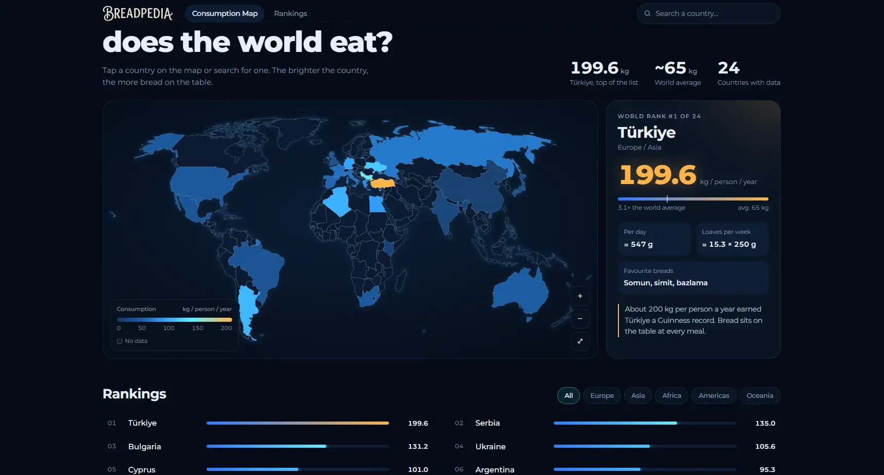
Ever wondered how your country compares? Who eats bread at every meal, and who only nibbles now and then? The new Breadpedia Global Bread Consumption Map lets you find out in a few clicks.
See the Data Come to Life
Instead of rows of dry numbers, the map lights up. The brighter a country glows, the more bread its people eat per year. A few things you’ll spot right away:
- The world average: around 65 kg per person each year.
- The clear winner: Türkiye, far ahead of everyone else at 199.6 kg per person annually.
- Some surprises: See how Europe’s famous baking nations stack up against the average, and which unexpected places turn out to be bread hotspots.
Why Give It a Try
- Click or search: Tap any country on the map, or type its name in the search bar, to see its yearly bread consumption instantly.
- Compare with ease: Open the Rankings tab to sort countries by region and view them side by side.
- Fun for everyone: Whether you love food, culture, or just a good chart, it’s an easy and enjoyable way to explore how the world eats.
Ready to Explore?
Curious how your home country measures up? Open the Breadpedia Bread Consumption Map and find out where the world’s biggest bread lovers live!
Keep reading
All posts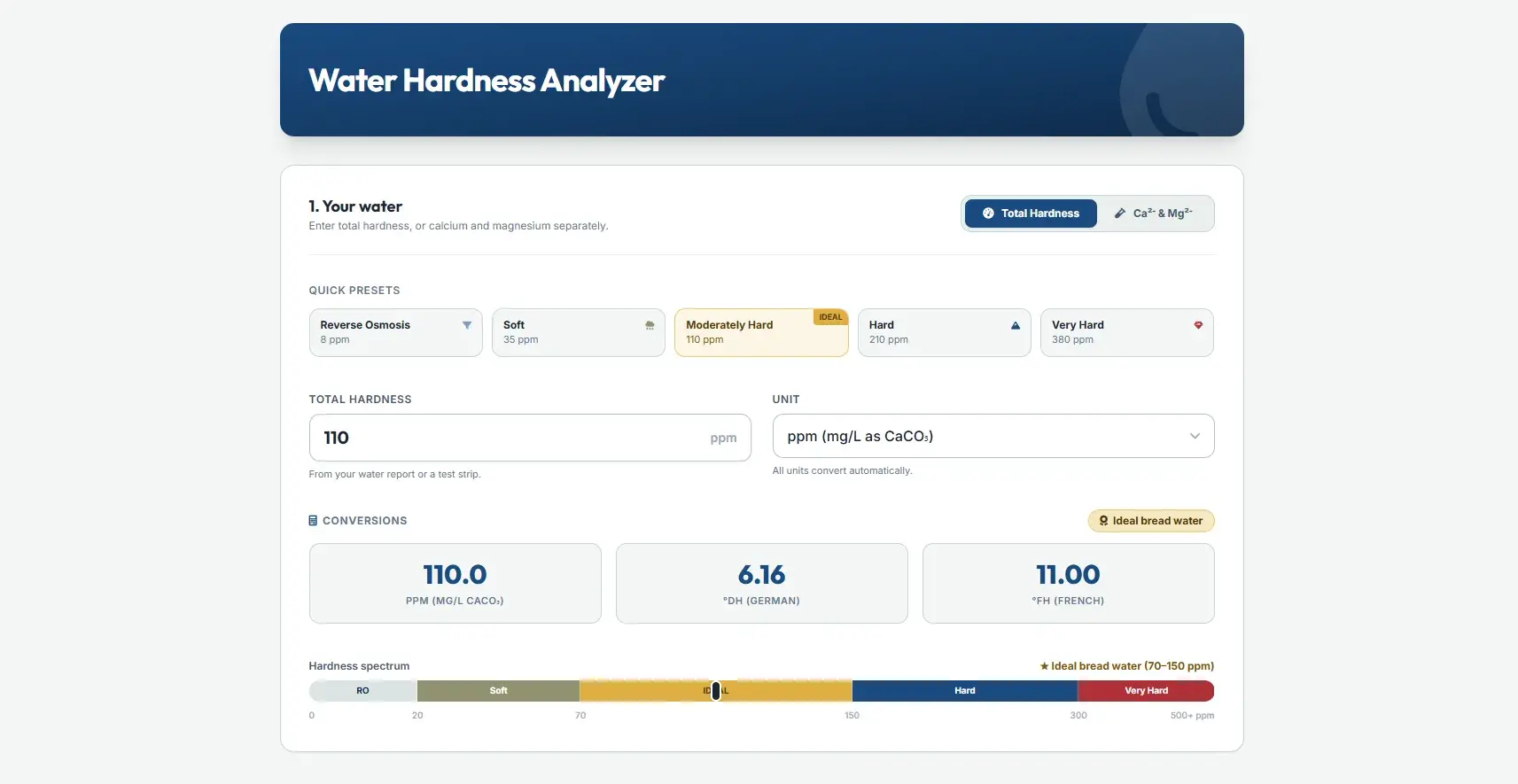
Water Hardness Analyzer
Every baker knows the basics: flour, water, yeast, salt. We fuss over protein percentages and starter hydration, but the water itself rarely gets a second…
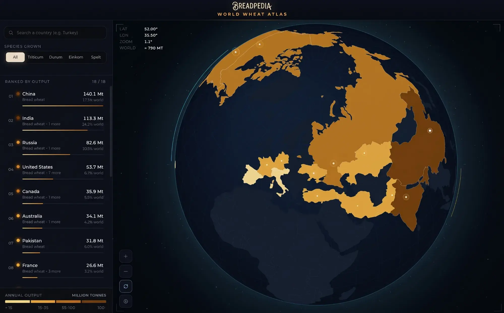
World Wheat Atlas
The World Wheat Atlas is a dynamic 3D digital globe that tracks and visualizes global wheat production.

Starch Retrogradation Analyzer
Few things are as inviting as the aroma of freshly baked bread with a crispy crust and a soft interior.